
Put a Little “Spring” in Your Step
As a native Memphian, I can remember the days when we actually had 4 distinct seasons. As of late, however, Spring and Fall seem to be a 2 week minor blip in between 9 degree ice storms and 100 degree scorchers. That doesn’t mean you can’t enjoy a little eternal spring where you nest. Looking out at the dogwood blooms and tulips scattering the yard gives me a feeling of renaissance and renewal, and makes my mind scream: “project”! If you are feeling antsy and tired of camping out on Pinterest, get off your tablet and try some of these ideas for yourself.
Cleanliness and Color
I know it’s a cliché, but nothing gives one a feeling of renewal better than a good “spring” cleaning. Try making your own natural environmentally friendly cleaners this time. These recipes are easily found on Google, and are better for you and often cheaper than buying store bought toxic cleaners. Don’t just spring clean; spring edit. Get rid of stuff you don’t need and try to recoup some of your investment on eBay or consignment. While you are doing this try thinking outside the box. Move things around like you’ve never had them, borrow things from other rooms, pull out vintage items from the attic and repurpose them. And for heavens sake, clean your windows, open up the blinds/drapes, and let the sunlight in! While you are at it, lighten up a room by repainting it, or at least paint an accent wall with a pop of color that picks up some of your accents. Wallpapers are fun again and I do lots of accent walls these days using wallpaper.
Bring Mother Nature Indoors
Plants and natural elements really do uplift the spirit and give one positive feelings upon entering any room. Bring in potted plants, cut aromatic flowers in bowls, and change out your faux floral mixtures. Don’t forget to change out your incense and candles to a more linen or light floral selection. Try unique touches like using old outside pots or wood crates for plants. Buy bushes and plants you can display in the home and then plant them in the yard later. Window boxes are fun to build and display annuals outside every window.
Change Out Key Accents
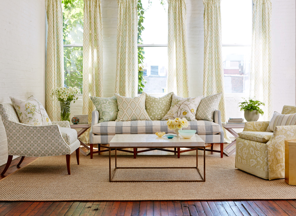
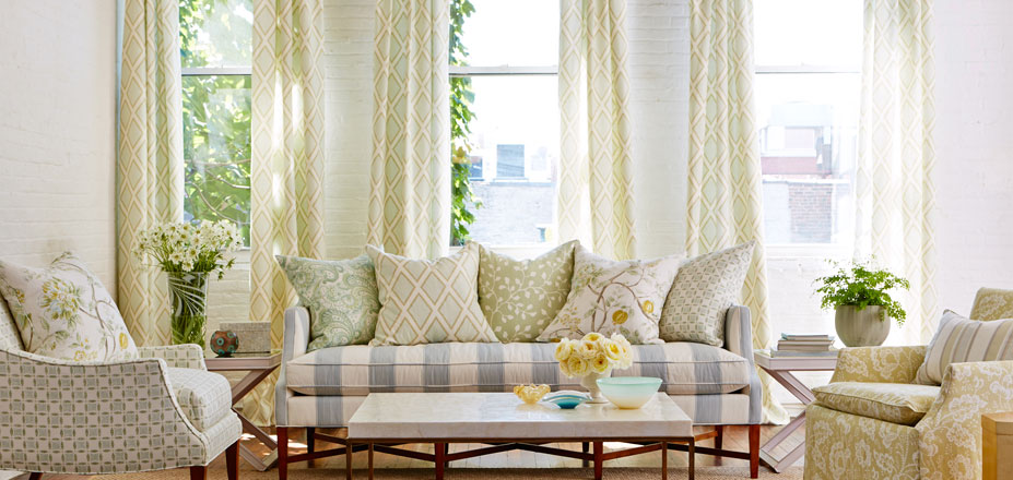
Seasonally changing out the accents in your room while leaving the core pieces in tact, can easily give you a whole new look and feel. At TannerMeyer Drapery, Bedding, and Blinds I have worked with clients that have done this for years. Many of our clients have us make them a set of Spring/Summer accent pillows and drapery. Take down your heavier printed drapes and change them out with a light and airy linen or sheer. Switch out your traditional Persian rug with a crisp clean jute rug for the warmer months. Even switch out your accents with a lighter “less is more” approach. Repurpose your Fall/Winter accents throughout your house so they don’t’ go to waste. It’s amazing what a minimal investment in accent pieces can do to dramatically change a room and ones’ spirit over the course of a weekend.
It is often said: “change your image and change your life”. The same goes for your surroundings! Put in the time now, and you’ll be kicking back happily sipping mint juleps and mimosas for many warm months to come.


Three Simple Questions to Design Success
By Kip Meyer & Tim Tanner
Tim Tanner and I have owned a drapery, bedding and blind store in Memphis for nearly a decade; first under a franchise name and now as our own, TannerMeyer. Throughout the years we have dressed thousands of windows and beds and have been blessed with thousands of happy clients! Working with so man creative, wonderful clients and designers has taught us many lessons along the way.
Two things we’ve learned is that most homeowners want to fill their spaces with products that are beautiful- but also affordable. In the interior design world, it is easy to get lost in the world of $300+ per yard fabric and trims and over design yourself right out of most people’s pocketbooks. Though just about anyone can appreciate beautiful design, the most common feedback we have received from our customers is that they want the design process to be EASY while still achieving their desired look. We have also learned that the majority of customers shop two ways: by color and by price.
A third category that we focus on (which is often overlooked) is functionality. This often means light control issues. Will the afternoon sun fade the window treatment fabrics on the west side of the house? If not lined properly, the answer if definitely “yes.” Will light gaps appear where we least expect them? They certainly can if obstacles are not addressed before the purchase and installation.
This past summer, Tim and I visited the huge International Textile Market in High Point, North Carolina. We attended seminars on new and exciting fabrics, learned how to combine existing styles with new and innovative designs, as well as attended multiple seminars on color trends. We took the knowledge we gained from that experience and applied those tips and trends to our selections for the most recent VESTA Show Home and The James Lee House.
In the VESTA Show Home “The Maple,” we wanted to not only focus on the design of the home, but also on the products that offer great functionality and reliability. After all, these products affect the way we live our everyday lives. That is why in the kitchen, and the master bedroom we selected products never seen before in a VESTA Show. The “Silhouettes” and “Pirouettes” shades by Hunter-Douglas are not only beautiful, but they also protect wood floors, furnishings, and art work from fading by the way they filter light into a room. In addition to the function of these shades, they still allow you to have a view outside when the shades are open! When you want total privacy, the vanes of these products completely close, and when you want a full, unobstructed view, the shades completely disappear into their own head rail.
While cream and taupe have been common staples for the past five years, this staple neutral is changing. It is all about color, color and more color. In addition to more color, big & bold patterns are also making resurgence. The combination of a large scale and colorful print in an updated design keeps the Southern home traditional yet modern.
Another home we did was The James Lee House (www.jamesleehouse.com). This historic mansion sits in the middle of Memphis’ Victorian Village and owner Jose Velazquez has transformed this estate into a world class Bed & Breakfast. The window challenges we faced here were many: a. create fabulous window treatments that not only portrayed the period the house was built but also create something more fresh and transitional, b. create window treatments that were fabulous but within the owners budget, & c. make window treatments that were 14 feet long that blocked light and drafts. In the picture you will see the living room and dining room. We got our inspiration from an actual picture of this fabulous room from the mid 1800s. However, we did not want to hang heavy Victorian velvet patterned drapes. The solution was to install natural free flowing silk drapes in a current neutral blue solid, and add lace sheers reminiscent of the “old south”. Not only did we achieve a fresh look but we combined it with period sheers. At the same time we played with linings and interlinings to achieve the thermal, light, and noise control necessary for the needs of this establishment.
Whenever you are entering into any design or renovation project, ask yourself the three simple questions. What is my vision or design? What kind of functionality do I want to achieve? And what is my budget? If you are honest, one of these will outweigh the others. Either way, answering these three simple questions will lead you on your path to design success!
Home Color Trends From TannerMeyer Drapery, Bedding & Blinds
Once a year Kip Meyer, co-owner of TannerMeyer Drapery, Bedding & Blinds, and I travel to the Market in Highpoint, NC to buy fabrics, bedding, and accessories. Believe me when I say it’s a multi-day experience meeting hundreds of vendors, seeing thousands of items, and walking for 10 hours a day. However, on the last night of our adventure (throbbing feet elevated on pillows and a full bottle of Chardonnay at hand) we were inspired by the latest colors and trends we are seeing in the home market. It’s a widely known fact in the industry that color trends in the home tend to mimic the apparel market—albeit a couple of years behind. Color trends also are influenced by the economy, books, TV, world events, and movies. For instance, gray and taupe dominated the market during the recession. Now that the economy is on an uptick, we are seeing vibrant colors bouncing back into the picture–with a bang! Speaking of color and world events, the last couple of years have seen Great Britain in the limelight with the Diamond Jubilee, Olympics, and the royal wedding/pregnancy, etc. Big are the vibrant reds and blues of the royal flag this year. In fact, there were many more color trends in the home market. Let me highlight them.
Warm Metallics
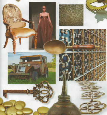
Metallic Interior Design Trends
Because of movies such as “The Great Gatsby” the “roaring 20s” is a big trend in both clothing and home couture. Vintage influences added to modern are popular, and lace overlays and metallic embellishments are all the rage. The use of burnished brass or brushed copper can add a timeless look to any room and be both contemporary and traditional, without being hard and edgy. In fact, we have seen a rise in sales of metallic fabrics in the last couple of years locally.
Floral Bouquet

Red interior design trends
Remember red? Well, it’s back. Not the Ralph Lauren dining room red that dominated the 80-90s. I’m talking about the vibrant reds. This year we are seeing reds such as cherry blossom pink, coral hibiscus, and poppy red. In fact, these reds and other vibrant colors are finding their way back to the home in large floral designs or futuristic geometrics. Vintage aged floral patterns are also big.
“Am I Blue”
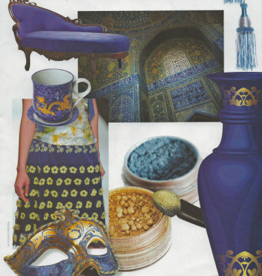
Interior Design Trends Blue
Navy is the new black. In fact, many designers now regard shades of medium to navy blue as neutral tones. What really stands out this year are the pops of vivid blue, such as sophisticated sapphire, bold aquamarine, or violet. This look is elegant but also classic and comfortable. Velvets are hot this year, and many have lovely blue tones (in addition to the popular metallic velvets).
Spice Market

Spice Trends Interior Design
We are seeing lots of designs that are mixing sensual spice colors. Cinnamon and chili are splashed with cream, mustard, or dark coffee. Mixing cultures is the new way to make a room look eclectic, and the color of spice lends itself to many multi-cultural items. Spice often hints of warm fall leaves, but it can also sizzle with heat. An updated 60’s and 70’s retro mix is big as well.
Ladies & Gentleman, the color of the year is: Emerald Green
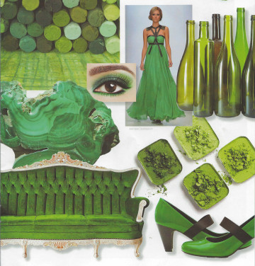
Emerald Green Pantone Color of the Year
Verdant Greens and emerald greens are popping up everywhere. Cool moss or mellow fern colors add a relaxing mix to any room. We are seeing a mix of warm, cool, and khaki greens with the more high –browed emerald. To soften your greens mix them with browns or milky white. Notice the major use of emerald in the recent “Oz” movie, and the release of the “Wizard of Oz—3D”?
The next time you go to pick a paint color, don’t just grab that tried and true beige or taupe. Think of at least a pop of color on an accent wall! Don’t pick that safe fabric you’ve seen for years. Pick the large vibrant print! Or, if you don’t want to commit to the large print on a big scale, use it in pillows and/or accents. Try to instill fun and interest with mixing cultures and adding metallic to your space. After all, times have been tough. Don’t we deserve a little color in our world!